FONT CHOICES AND CONNOTATIONS
It is important to choose the correct font when thinking about the titles in an opening title sequence, as it can really effect the atmosphere of a horror film. It can change a terrifying sequence into a laughing stock if the wrong font is chosen.
TIMELINE OF EXAMPLES
1931 - FRANKENSTEIN
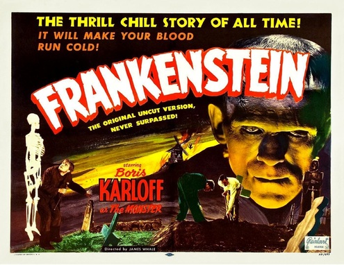
Honestly, if this poster was released for a film coming out in the next year, you'd probably assume it's some kind of spoof or comedy. The bulky white font with red outline just screams gaudy. The font is too cartoony for a horror and the use of colour is too comic-book like.
1944 - THE MUMMY'S GHOST
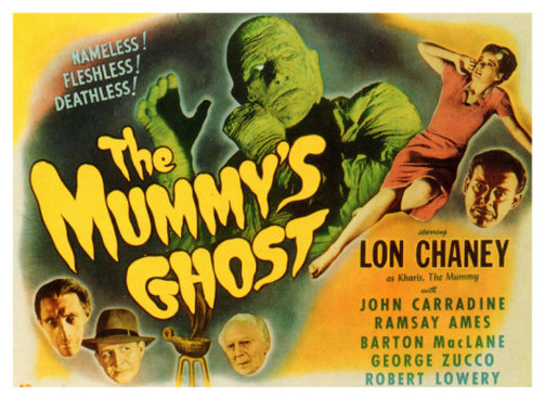
The bubble-like font and use of colour makes for a horrifying title, but not in the way I'm sure they aimed for. Sunflower yellow is not a good colour for horror, and again the font looks like it belongs in a child's comic book.
1958 - THE BLOB
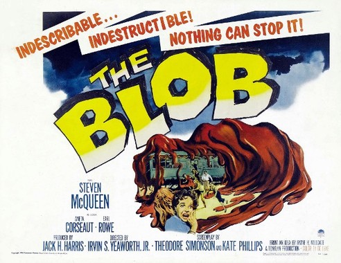
The gaudy colour and even gaudier font choice makes this poster look like it was for a comedy rather than a horror film. It's blunt, hand drawn look would probably mean the film wouldn't be taken that seriously if it were released in the near future.
1960 - HOUSE OF FRIGHT
The rough edged font I imagine is meant to look scary, although looks more like what you would find in Beano. The font not being quite in a straight line just makes it even more comedic.
1970 - THE DUNWICH HORROR
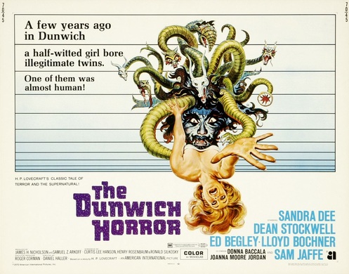
The colour purple coule almost work for a horror poster, but paired with the bright green and blue looks more like the colours of Scooby Doo's Mystery Machine. The font choice isn't actually that bad, better than the previous posters at least.
1980 - THE CHANGELING
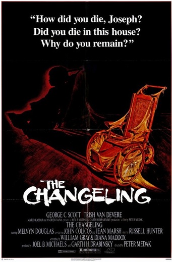
The colour choice for the font isn't actually that bad here, although is a little harsh for a horror film. The paint-like style of the font doesn't look fitting for horror and the tagline would look much more professional if it were all in capitals.
1992 - ALIEN 3
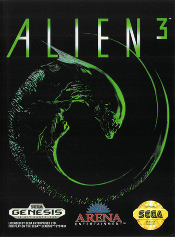
Finally, titles are beginning to look more sophisticated and horror-like rather than that which would be found in a comic book or comedy. The simple font stands out and paired with the green looks very clean and professional.
2005 - THE AMITYVILLE HORROR
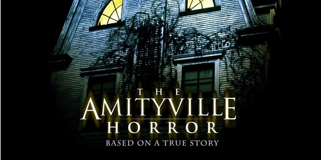
The off-white title stands out clearly against the dark background, yet also looks clean and sophisticated. It is around this time that horror film posters featured the simple, Times New Roman style fonts. This is effective as it's a font that is used in every day situations and so the audience will unknowingly link the plot of the film with real life.
2012 - THE CABIN IN THE WOODS
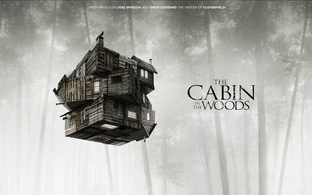
The simple font works well with the subtle filling of the title. The variation in size draws attention to the word "cabin" which is the most iconic symbol of the fiml, and so would work well with their trailer which also focuses on the cabin.
Other recent/upcoming titles
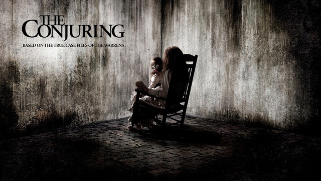
2013 - The conjuring
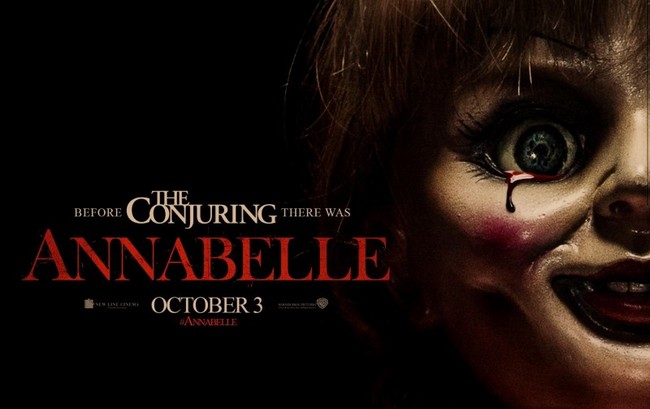
2014 - annabelle
Conclusion
As horror films have progressed through the ages, the titles have got simpler and clearer. This makes them look more professional and serious compared to older horrors such as Frankenstein. Therefore we think it would be a good idea to use a simple font as we want our trailer to look more modern and serious.
