Poster Experiments
initial photo shoot
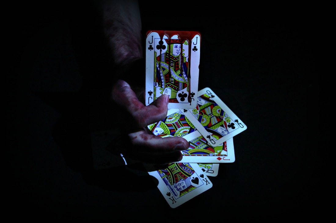
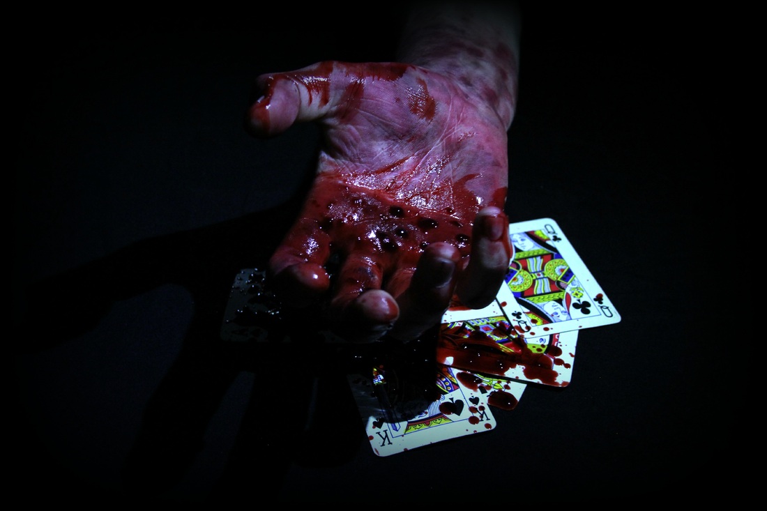
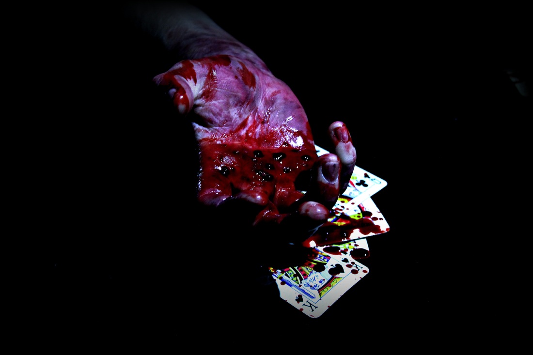
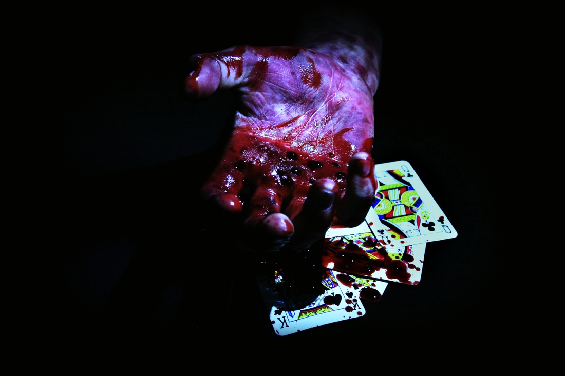
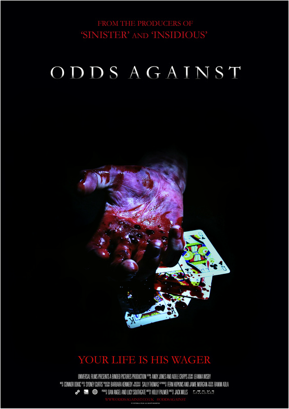
When brainstorming for our poster, we had to keep in mind our iconic imagery so that we could create a brand identity between our poster, magazine cover and trailer. We noticed that the most prevalent symbols in our trailer were the killer's hand, playing cards and one of the female victims. We decided not to use a victim in our poster as we thought the simpler, the better. For this reason, we focused on shots with the killer's hand covered in blood or bruised whilst over or holding playing cards.
What went well
Some of the shots, our killer's hand didn't look natural, however some shots are really effective. We also thought our use of lighting was successful as it created some clear contrast and shadows meaning little editing would need to be done. The fake blood also looked good on camera as it had a deep colour and right consistency. We then chose a few of our favourite photos to experiment with on photoshop to see what kind of looks we could achieve.
Poster Editing Experiments
In this experiment we changed the contrast and added blood dripping down the card. However this looked quite fake, and so we thought it better to use an image where the blood was physically in the shot.
In this experiment we altered the colour of the hand and brightened the colours of the cards. We also made the cards a lot sharper and clearer so the focus would be on them more.
In this experiment, we looked at creating a really obvious contrast between the bright colours of the cards and the dark colours of the hand. We also brightened the colour of the blood.
|
In this experiment we looked at how we could make the cards look more aged and grotty. Although we liked the end product, we concluded that having clean, white cards would create a better contrast.
In this experiment we darkened the blood and lightened the skin in order to create a greater level of contrast. We also created crisper shadows over the cards.
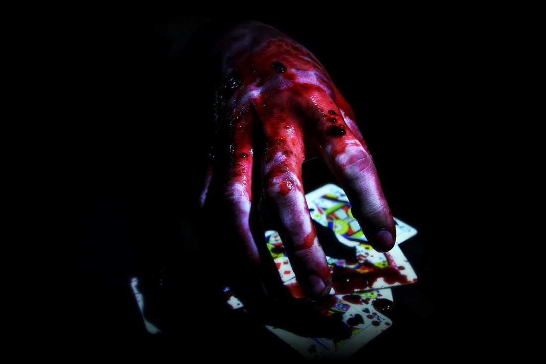
In this experiment, we faded the hand into black to create a greater sense of mystery. We also made the blood brighter and blurred out the cards so that the hand would stand out more.
|
Magazine Experiments
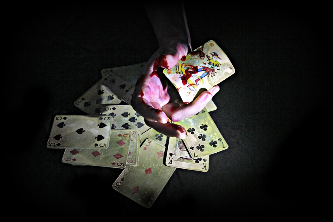
Initial Photo Shoot
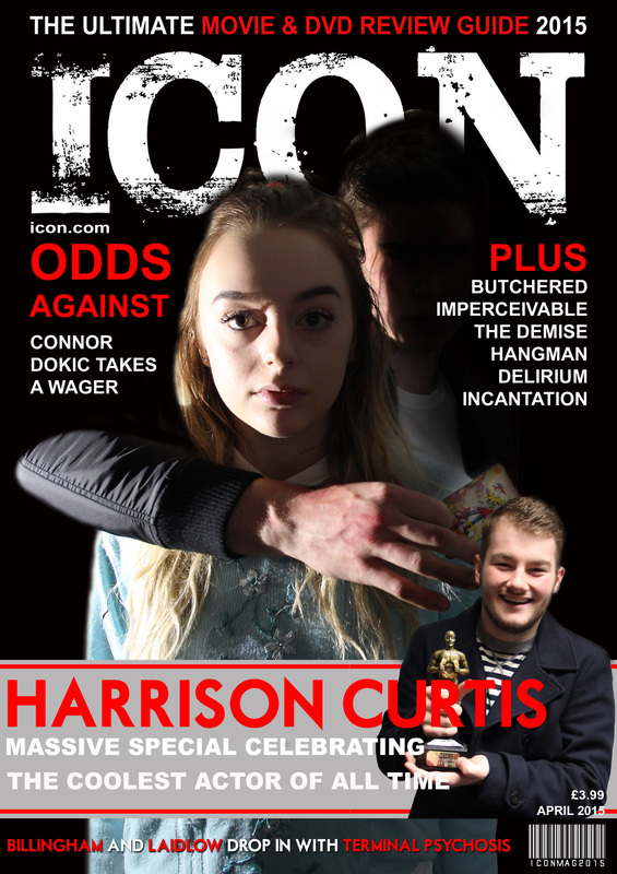
In these images, we experimented with altering the contrast and fading our characters into black to create a spookier and more ominous look. This also made our killer more mysterious and ambiguous, a trademark of him we wanted to keep going through our poster, trailer and magazine cover.
(SC+AJ)
