Iconic SYmbols
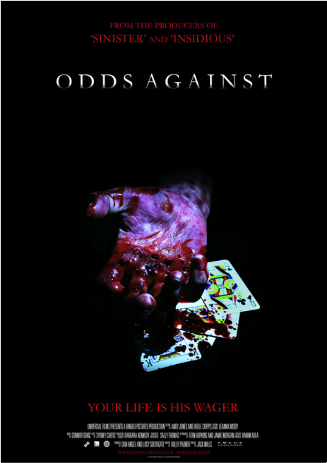
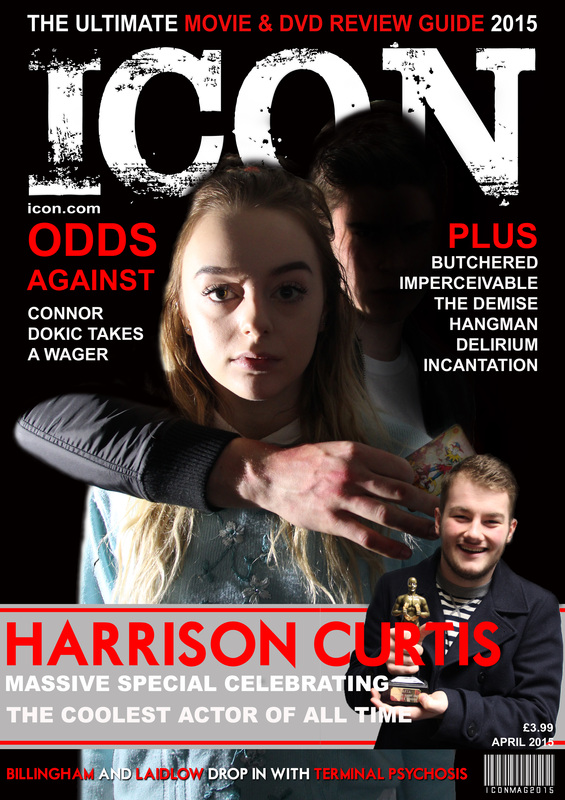
We sat down with members of other groups to watch our trailer in order to decipher our most iconic imagery. We decided that they were the bloody hand over playing cards, over bingo cards, holding a joker or over a victim's mouth. For this reason, we experimented with all of these ideas when planning our poster and magazine. What ended up looking the best was a bloody hand over playing cards for our poster, and for our magazine, the killer's hand holding a card around our victim. Our killer also has an iconic mode of transport, a white van which is crucial for his kidnapping.
|
|
In our poster, we used the bloody hand over playing cards as our chosen icon. We used the same colours as what we used for the titles in our trailer to better initiate our brand identity. In our magazine, we incorporated the hand holding a joker and hand around our victim to create a bond between all three of our products. This will make it easier for our audience to distinguish other products that could be linked with our trailer. We also used language iconic to our horror, mainly gambling terms such as "wager" and "odds against." We also used the same font on our poster as in our trailer to create a distinctive link between them.
(SC)
