Film Magazines
|
|
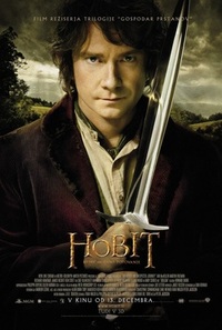
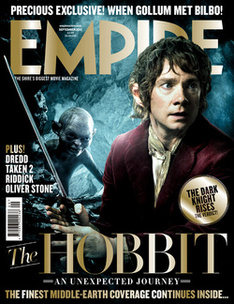
Both the film poster for 'The Hobbit an unexpected journey' and the front cover of the magazine 'Empire' have a image of the main character from 'The Hobbit' on it. The man on the poster is stood looking at the camera, posing, as for the character on the magazine where it looks like it's a shot that has been taken from the film. On the magazine front cover the title 'Empire' is the colour gold so it stands out from the dark background and also links to the colour of the title on the movie poster.
|
|
|
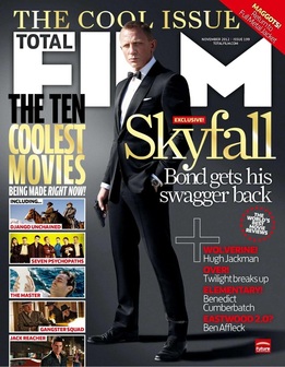
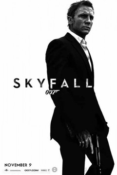
In both the movie poster for 'Skyfall' and the front cover of the 'Total Film' magazine, they both have the iconic image of James Bond stood there in his suit with a gun in his hand. The images from both the poster and the magazine are quite different because in the poster he looks quite scruffy, as if he's just been in a fight. The magazine front cover still has Bond dressed smartly, in his suit and bow tie with the gun in his right hand, the same as the poster. It mentions the words "Bond gets his swagger back" on the front cover of the magazine, so the image of Bond has to relate to it, which it does. The background for both the movie poster of 'Skyfall" and the magazine front cover of 'Total Film' are different because, on the 'Total Film' magazine front cover
they use a dark background, which maybe isn't as effective as the poster as they use a white background so it looks like a silhouette of Bond which makes him really stand out from the plain white background. |
|
|
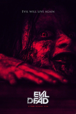
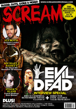
Both the movie poster and the front cover to the Scream magazine have the same image. On the movie poster the image is in red and black which works really well because red and black are the colours you'd link to horror. The image on the movie poster is a closer up image to the image on the Scream film magazine. The font on the movie poster is also the same as the font on the Scream magazine apart from the colour is slightly different.
|
|
|
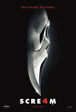
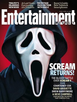
The poster for 'Scream 4' is similar to the front cover of the magazine 'Entertainment weekly' with 'Scream 4' on the front. They both have the iconic image of the scream mask so the audience will instantly know it's a new Scream film. In the poster, the bottom of the face is a blade of a knife which represents death. The poster and Magazine front cover both have different colour backgrounds. The magazine has a red background which is a colour that you associate with horror because it represents things like blood and death. The poster just has a black background so the white face is the main focus point to the audience.
|
(AJ)
