Question 2 - How effective is the combination of your main product and ANCILLARY text?
Branding can help you stand out from your competitors because the stronger the brand the more effective or well known the iconic image will be, which will attract more viewers for your movie. The iconic images in our horror teaser trailer are the hand and cards with blood on them, which are the main things that stand out to our viewers watching. We wanted the cards to be one of the main iconic images in our horror, as our horror is related to teenage gambling. The image of the hands with the blood on them on top of the cards is definitely the main focus point for our viewers as we found out with our audience interviews after we'd finished our teaser trailer. With the poster and magazine it's key to get an iconic image from our horror which we thought would stand out to our audience. With our magazine we wanted to make it different from the poster by having an image of our killer with one of the victims. We didn't want to reveal much of the killers face on the magazine front cover because we didn't want to give the killer away to our audience.
Iconic props/symbols within our horror films
Here are some examples of some iconic fonts from different films over the years, which pretty much all people would and should recognize.
|
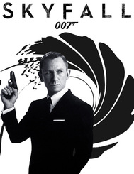
Most people know when they see '007' it's to do with James Bond because it's so iconic due to the fact all the James Bond films are massive and are so well known. On the more recent James Bond posters they don't even have to include his name because the '007' image is so iconic to us as the audience. The font is kept very simple so it stands out to the audience but the one thing about this that makes it so iconic is how the '7' on '007' has been made into a gun shape. This is what makes '007' so iconic.
|
|
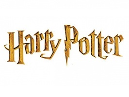
The Harry Potter films are so well known all around the world, that anything to do with the Harry Potter films would be recognized by a wide range of people. For Example the Harry Potter font should be easy to recognized by anyone who's watched any of the Harry Potter films because of how iconic it is. The Harry Potter font isn't as simple as some other well known fonts, but it is recognizable for anyone because of how popular the Harry Potter films are. The P in the word Potter is shaped like the scar on Harry Potter's forehead, which links it to the films itself.
|
|
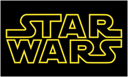
The 'Star Wars' font is kept really simple by having the dark background and the bright yellow outline to the writing to make it stand out to the audience watching, and to make it memorable and iconic.. The font is kept basic so it is clear to read for the audience watching. The Star Wars films are very iconic because of the bold title and because of it's soundtrack, which makes the audience remember the iconic points in the film.
|
Poster
Requirements:
A2 Media Studies required the group and myself to create a teaser trailer of the genre of horror. This also included the ancillary task of making a poster and magazine cover for our ideas for our film. I researched the significant codes and conventions of horror magazine and poster in order to expand on the audience demographic effectively and efficiently.
After thoroughly researching and analysing posters, the main purpose is to simply grab the spectators perspective, and also provide people with information. Sometimes posters are designed to make the spectators curious about something, and encourage them to seek out further information of their own accord.
Movie posters are also used to advertise an upcoming film; through letting audiences know that a new film is due for release, which raises awareness and in turn aims to generate adrenaline A film poster provides significant information on an upcoming film such as; the name of the film, the release date, the stars/actors and actresses who are in the film and the BBFC certification.
|
This is our original image that we used for our poster. We created our own fake blood which looks really effective even before editing it.
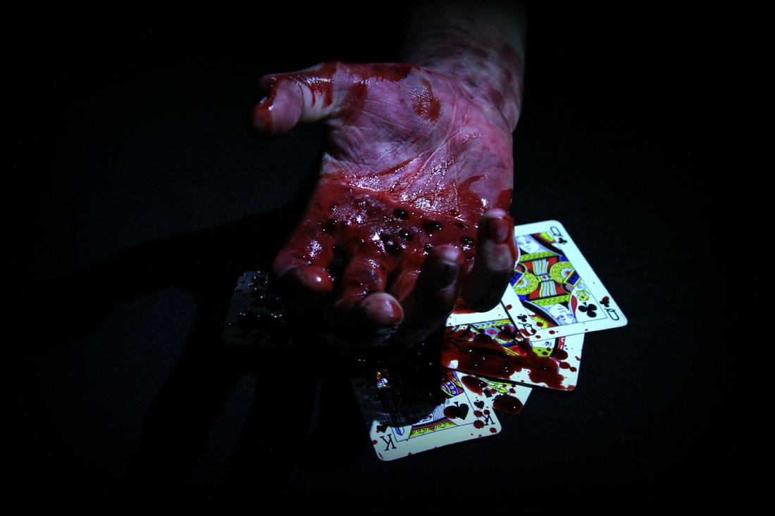
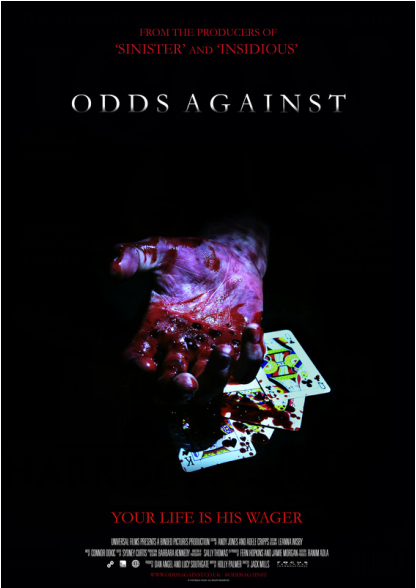
Final Poster This is our final poster, we've gone for the dark background so our titles stand out on it. For our main title we went for the colour white because it is the best colour to stand out on a dark background to our audience. We tried different effects on our main title and we thought the one that looked best was where our title fades from white to black. Our other titles we had the colour red because it represents blood and danger but also looks good on the black background. Also having a dark background makes our image of the hand with blood on it really stand out to our audience. |
|
Analysis
|
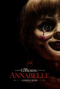
The Annabelle poster is simple because it's only got the Annabelle doll on it with Annabelle written in a red font to stand out from the dark background. It gives the audience an idea of what the film is about because of the creepy image of the Annabelle doll on the poster. Also on the poster it says before The Conjuring there was Annabelle, so for people who have watched 'The Conjuring' will know the plot of the film. I think this is a good horror movie poster because it's kept quite simple so the main focus when you look at the poster is the Annabelle doll and the red title 'Annabelle'. The tear of blood suggests the evilness in the doll. We took inspiration from this poster to make our poster as we thought the image looked good fading into the dark background. This makes the image the focus point when our audience is looking at our poster. We also looked at the font that was used, and it was kept quite simple so it was easy and clear for the audience to read.
|
|
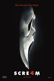
This poster is really effective because it's kept simple so the things on the poster stand out from the dark background. I like how the mask goes into dagger, which makes it really creative and by having it on a solid black background also works well as whenever the killer attacks its always at night when its dark. I also like how the 'a' in 'Scream' is the number 4 because it's the 4th Scream film that's been made. The title 'Scream' is also in a bold and simple font which makes it really stand out from the dark background. The Scream poster gave us an idea of how we wanted our poster to look. We wanted to have dark background so that our main icon would stand out against the black background.
|
Magazine
With our magazine front cover we wanted to make it different to our poster by having a shot of the killer with one of his victims. We didn't want to give too much away about the killer in our teaser trailer thats why most of the killers face is covered by the shadow. We went for quite a stereotypical victim on the front cover of our magazine, by having a young vulnerable female victim with blonde hair as seen in many other horror films. The writing on the front cover of our magazine is clear and easy to read for our audience looking at it. The colours red and white work well against the black background of our magazine front cover because the white writing is bold and clear and the red writing relates to the horror theme of danger and blood.
With our magazine front cover we wanted to make it different to our poster by having a shot of the killer with one of his victims. We didn't want to give too much away about the killer in our teaser trailer thats why most of the killers face is covered by the shadow. We went for quite a stereotypical victim on the front cover of our magazine, by having a young vulnerable female victim with blonde hair as seen in many other horror films. The writing on the front cover of our magazine is clear and easy to read for our audience looking at it. The colours red and white work well against the black background of our magazine front cover because the white writing is bold and clear and the red writing relates to the horror theme of danger and blood.
