Insidious
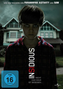
The insidious poster doesn't give too much away about the movie itself, apart from the fact the young boy is holding a direct gaze with the audience and this allows them to see what type of images are in his eyes. This makes him look like he's possessed as it looks as though something is in his body. Secondly the image in the background is of the house and it signals to the audience that it is set in a normal house with a normal family and this relates to real life. The dark cloud in the background could represent danger or something evil. The clouds on the right are darker than the clouds on the left which could represent good vs. evil. In the title 'Insidious' the 'si' is in the colour red, this could represent it means 'is in' which gives the audience more of an idea of what the film could be about.
The insidious poster doesn't give too much away about the movie itself, apart from the fact the young boy is holding a direct gaze with the audience and this allows them to see what type of images are in his eyes. This makes him look like he's possessed as it looks as though something is in his body. Secondly the image in the background is of the house and it signals to the audience that it is set in a normal house with a normal family and this relates to real life. The dark cloud in the background could represent danger or something evil. The clouds on the right are darker than the clouds on the left which could represent good vs. evil. In the title 'Insidious' the 'si' is in the colour red, this could represent it means 'is in' which gives the audience more of an idea of what the film could be about.
The Conjuring
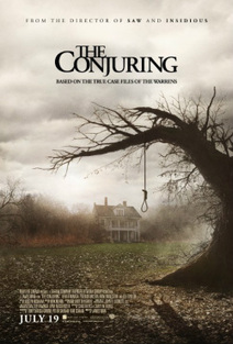
The Conjuring poster is effective as it leaves the plot to the imagination of the audience. We as the audience can see it involves death which is indicated by the noose on the tree and that the plot could be evolved around an isolated house. The old house which looks abandoned surrounded by mist creates the horror feeling in the poster. Following this it’s very clever how there’s a shadow on the floor of the poster which looks to us like somebody being hung in the noose yet on the poster there is no person visible hanging, this could tell the audience there's a theme of paranormal and mystery in the film. Adding to paranormal films, they are not typically based around blood and gore like other sub genres therefore the use of just black and white in the poster without red further promotes a paranormal feel. The tagline underneath creates the feeling that this will be based on true events. This makes the audience wants to go and see the film and maybe even research this after to see if these events are true.
The Conjuring poster is effective as it leaves the plot to the imagination of the audience. We as the audience can see it involves death which is indicated by the noose on the tree and that the plot could be evolved around an isolated house. The old house which looks abandoned surrounded by mist creates the horror feeling in the poster. Following this it’s very clever how there’s a shadow on the floor of the poster which looks to us like somebody being hung in the noose yet on the poster there is no person visible hanging, this could tell the audience there's a theme of paranormal and mystery in the film. Adding to paranormal films, they are not typically based around blood and gore like other sub genres therefore the use of just black and white in the poster without red further promotes a paranormal feel. The tagline underneath creates the feeling that this will be based on true events. This makes the audience wants to go and see the film and maybe even research this after to see if these events are true.
Scream 4
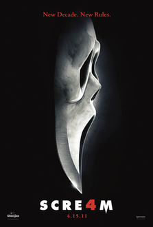
This poster is really effective because it's kept simple so the things on the poster stand out from the dark background. I like how the mask goes into dagger, which makes it really creative and by having it on a solid black background also works well as whenever the killer attacks its always at night when its dark. I also like how the 'a' in 'Scream' is the number 4 because it's the 4th Scream film that's been made. The title 'Scream' is also in a bold and simple font which makes it really stand out from the dark background.
This poster is really effective because it's kept simple so the things on the poster stand out from the dark background. I like how the mask goes into dagger, which makes it really creative and by having it on a solid black background also works well as whenever the killer attacks its always at night when its dark. I also like how the 'a' in 'Scream' is the number 4 because it's the 4th Scream film that's been made. The title 'Scream' is also in a bold and simple font which makes it really stand out from the dark background.
|
Annabelle
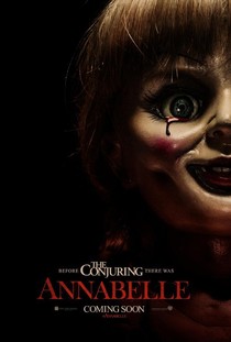
The Annabelle poster is simple because it's only got the Annabelle doll on it with Annabelle written in a red font to stand out from the dark background. It gives the audience an idea of what the film is about because of the creepy image of the Annabelle doll on the poster. Also on the poster it says before The Conjuring there was Annabelle, so for people who have watched 'The Conjuring' will know the plot of the film. I think this is a good horror movie poster because it's kept quite simple so the main focus when you look at the poster is the Annabelle doll and the red title 'Annabelle'. The tear of blood suggests the evilness in the doll. |
|
Sinister
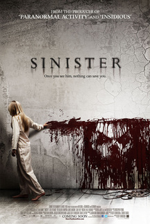
This is the main film poster for the film ‘Sinister’ being a key horror movie for the horror genre. Many key conventions have been used in the film poster. Colours play a big influence within this poster, red, white and black. Red connoting blood and death, white representing the innocence and purity of the little girl and black shows the darkness and worn emptiness effect distinctively showing all audiences that this is a horror film poster.The use of a child is very common is similar horror films in the film industry today. They have included in the header the producer that has also produced similar films to Sinister, ‘Paranormal Activity’ and ‘Insidious’. The fan bases of both these films will then be attracted to watching Sinister as they watched similar films.The quotation ‘Once you see him, nothing can save you’ creates an enigma for the audience drawing them in and wanting to find out more about the plot and ending of the film.The cracks on the wall connote decay and a disruption within the film giving the audience an insight of what’s to come. The image of the face is shown on other posters, showing the film consistency through is marketing campaign, It also shown in both the trailer and teaser trailer. As its used in all the different advertisements it becomes recognisable for the audience, imprinting this distorted image in their heads reminding them of the film. No specific date is shown o th poster anticipating the audience, but as the release date is unavailable it gives the audience chance to research into the film. Adding the website underneath the ‘Coming Soon’ text.The idea of the girl dragging the blood across the wall could connote the ‘monster’ possessing her taking over her body, controlling her, which is a very interesting and unique way of showing it.The clothing of the girl shows that this event occurs at night as she is wearing her pyjamas, being stereotypical the colour white connotes how innocent the girl is aswell as her being young and blonde. |
|
Oculus
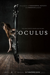
The conventional colour scheme of black and white, contrasting light and shadow conveys that this is a typical horror film poster. However the contrast of the light and dark is a type of binary opposite that illustrates the good and the evil, the evil being the mirror shown by the shadow it creates on the other side of itself. The girl seems to be climbing out of the mirror and that could mean that she is leaving the evil and stepping into the light/good. However the tag line ‘you see what you want it to see’ makes it seem as though it is not the light at all she is seeing, and she is not going towards her ‘good’ side. |
(A.J)
