Question 1 - In what way does your media use/DEVELOP/challenge forms and conventions of real media products?
Using and developing forms in our trailer
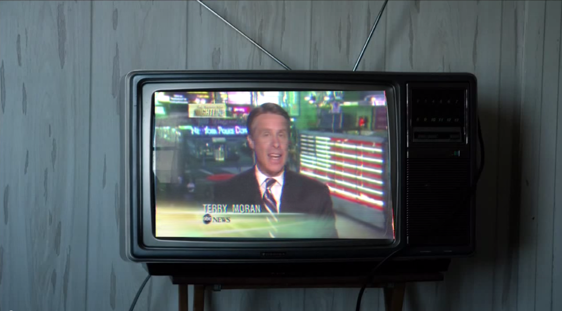
The Ring - 2002 |
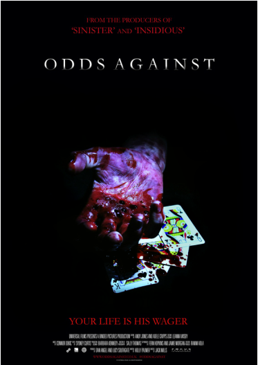
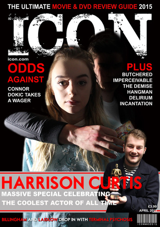
ODDS AGAINST |
|
|
|
We have used an old, crackly TV, similar to the one in The Ring - 2002. Using an outdated piece of technology follows the convention of horror settings being cut off from modern day life, creating a sense of being trapped and unable to contact or hear from civilisation. However, we used a modern television broadcast to highlight how teenage gambling is a prevalant issue in today's society, showing how horrifying these modern scenarios can be.
Texas Chainsaw Massacre - 2013
|
|
|
Just like in Texas Chainsaw Massacre - 2013, we have decided to use an iconic yet mysterious mode of transport so that our trailer stands out. A white van is also quite ambiguous as they appear a lot in everyday life and it is hard to tell what is inside them.
|
|
|
We have also made hands a large part of our trailer as we wanted to keep most of our killer's identity hidden. We also made sure to get shots of our killer's hands with a weapon to show how barbaric he is.
|
|
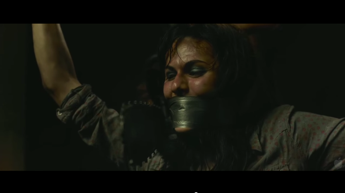
We included clips of a victim tied up and gagged similar to this one. This makes the audience feel sympathy for the victim and will encourage them to watch as these kinds of clips make it more obvious that our trailer is of the kidnapping/slasher genre.
Ouija - 2014
|
|
|
Just like in Ouija - 2014, we included many shots of hands with the objects that caused/did the killing. We believe this is very effective as it makes the characters more mysterious as there is enough you can decipher about a character to determine if they are good or bad, but not enough that you will know everything about them.
|
|
|
We of course had to follow the convention of having a beautiful, blonde girl in our trailer as this is one of the most iconic conventions of both classic and modern horror films.
A Nightmare on Elm Street - 2010
|
|
|
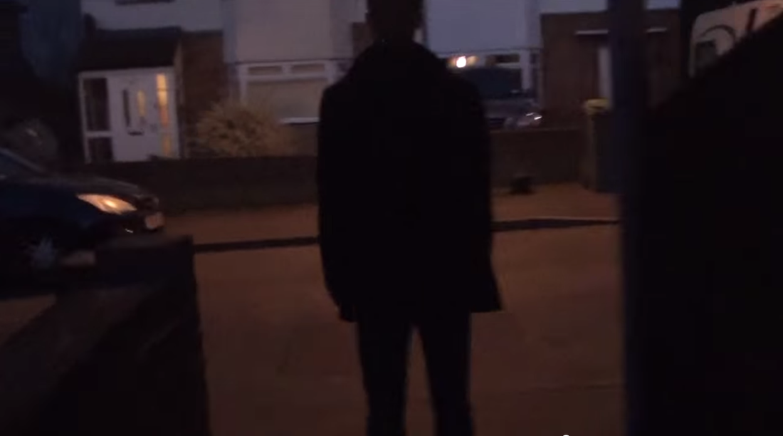
By only showing the shadow of our killer, like in A Nightmare on Elm Street - 2010, we have allowed our killer to remain dark and mysterious so that not too much about him is given away, encouraging our target audience to want to watch and find out more.
|
|
|
Just like in this film, we included many shots of hands with the objects that caused/did the killing. We believe this is very effective as it makes the characters more mysterious as there is enough you can decipher about a character to determine if they are good or bad, but not enough that you will know everything about them.
Challenging forms in our trailer - our killer
Having a handsome killer rather than ugly
We decided early on that we didn't want our killer to be revealed in our trailer, poster or magazine cover. However, this didn't mean we weren't going to be picky when casting the roll. We decided we wanted someone quite strong and muscular, but not overly so. We also wanted them to be tall and fit with dark hair as this juxtaposes the stereotypical killer in a horror. Killers in horror are often very unappealing to the eye, sometimes with body and face deformities due to some kind of tragic past.
Frankenstein's Monster: Frankenstein - 1910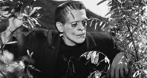
|
FREDDY KRUEGER: A Nightmare on elm street - 1984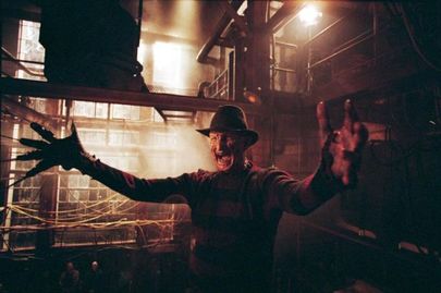
|
|
This lumbering, fearsome monster is a classic villain in horror and has reappeared in a variety of adaptions. His disfigurations adhere to the generic villain look.
Leprechaun: LEPRECHAUN - 1993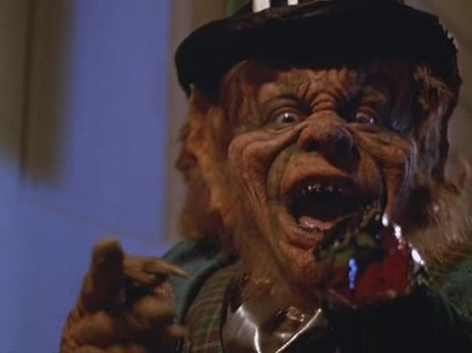
Wrinkled and grotty with mouldy teeth, this villain is scary, although not what we want to go for.
|
His burned face, razor-sharp shears and tattered sweater and fedora follow the conventions of villains in horror. Ugly, deformed and with a tragic past.
THE CREEPER: Jeepers creepers - 2001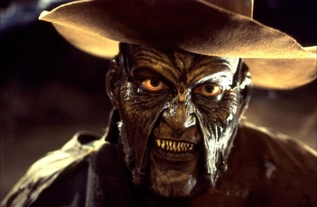
Like Freddy Krueger, The Creeper has a warped, wrinkled face and dirty, sharpened teeth. Despite being incredibly scary, we want our killer to be more modern.
|
Having a teenager rather than a child
Insidious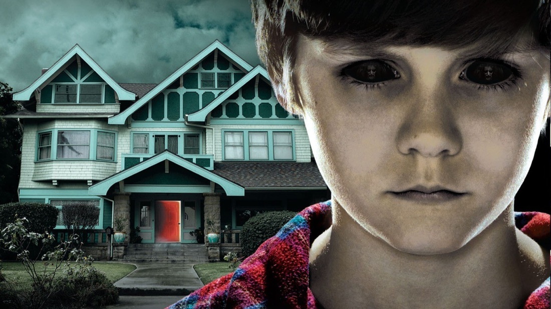
With an emotionless face and blacked out eyes, this child is particularly scary. The dark shadows are also very effective.
Orphan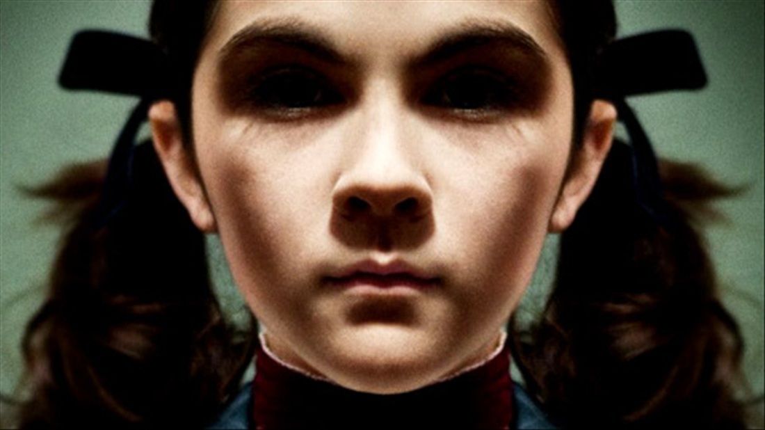
The ponytails are very effective as they make her look innocent, juxtaposed by the dark eyes, shadows and blank expression.
|
The exorcist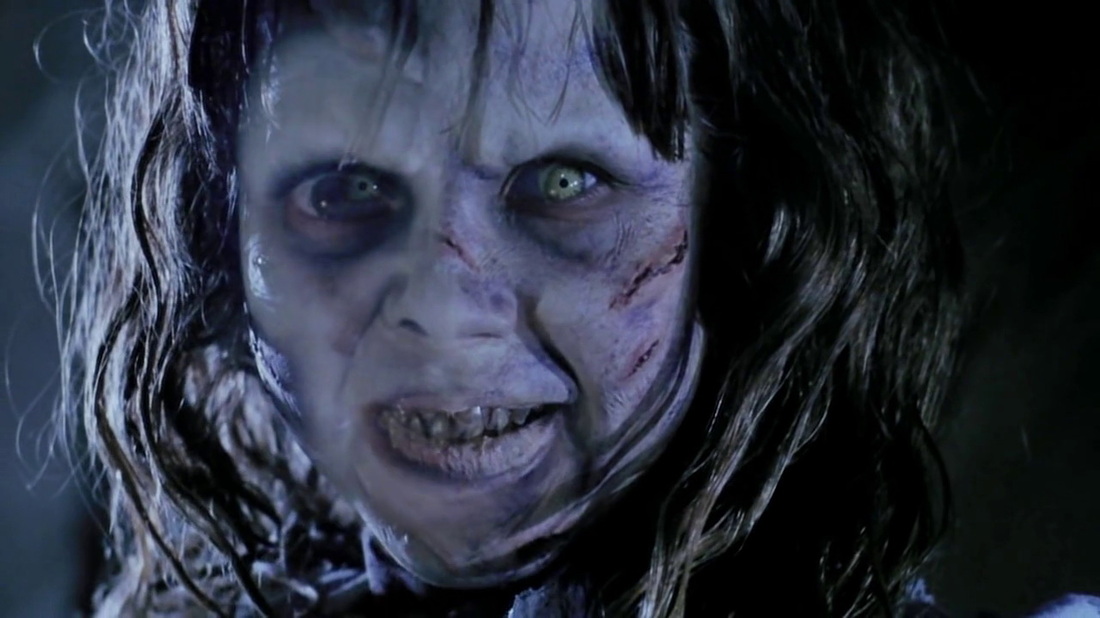
You wouldn't expect a young girl to have so many wrinkles and scars, making her deranged look even more terrifying.
Silent Hill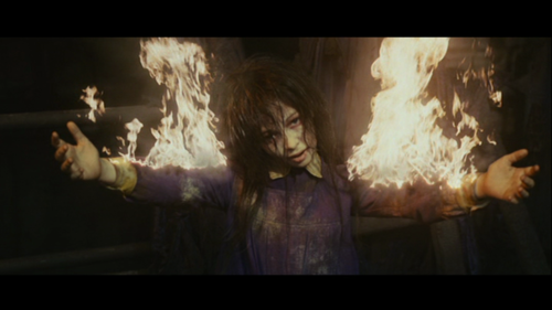
Dirty and mottled hair is what makes this child so scary, the fire being equally as terrifying as it's such an unusual, unnatural image.
|
Despite these all being very effective antagonists, we decided to put a modern twist on our killer. Young, sharp and charming. We decided a young man who might be considered to be an ideal gentleman would make a more shocking killer as the audience wouldn't expect it. For these reasons, we chose Connor Dokic to play the role of our killer.
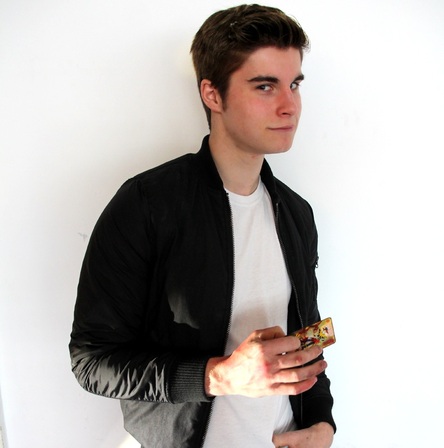
Connor Dokic - Odds Against
Using and developing forms and conventions in our poster
Using Lots of Blood
Like many modern horror film posters, ours includes lots of blood as this makes it obvious it is a horror film and also catches the eye of the audience easily. We also liked the way red contrasted with the black background and also has many connotations of horror, danger and death.
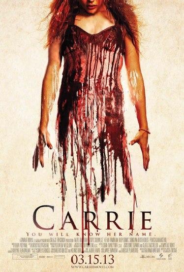
Carrie - 2015
|
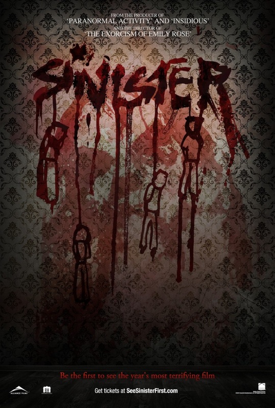
Sinister - 2012
|
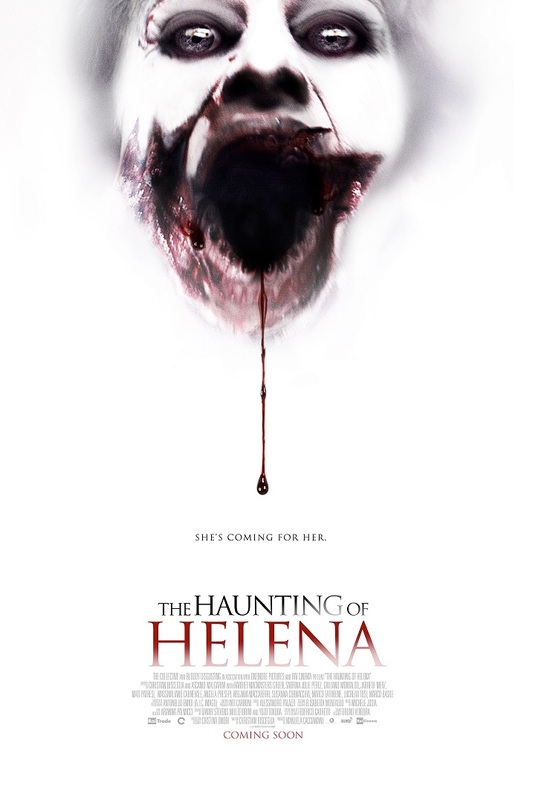
The Haunting of Helena - 2012
|
Use of hands
We decided to use hands in our poster as it does not reveal much about the antagonist or protagonist. Hands are also considered a barbaric and animalistic way of killing someone.
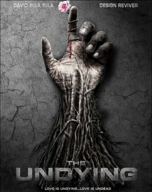
The Undying - 2009
|
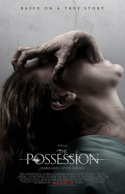
The Possession - 2012
|
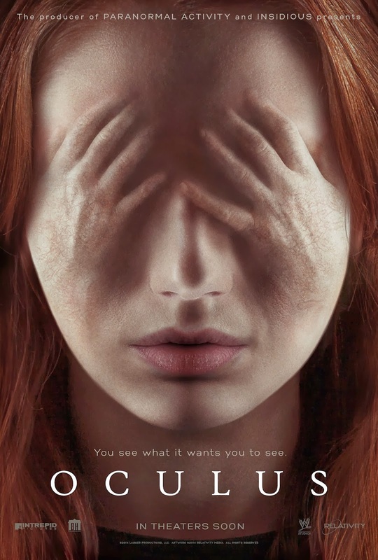
Oculus - 2013
|
Using black as a main colour
We chose to use black as our main colour as it is iconic and symbolises mystery and death. It also makes the objects in front of it stand out. Black also connotes to shadows and hiding secrets.
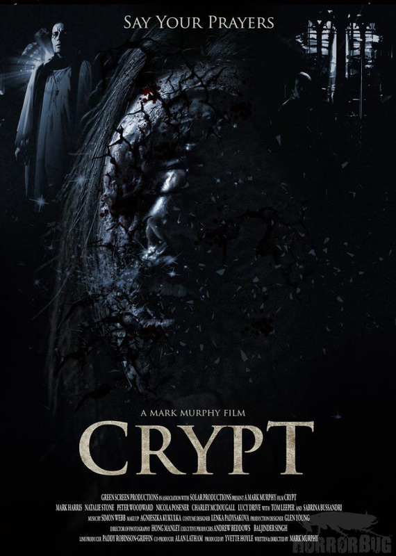
Crypt - 2013
|
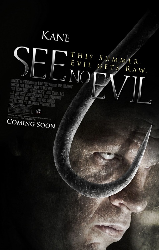
See No Evil - 2006
|
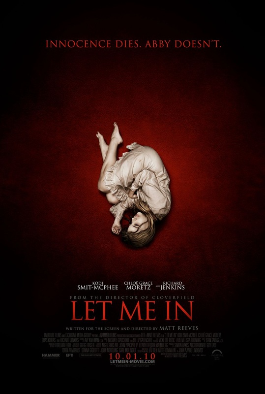
Let Me In - 2010
|
CHALLENGING Forms and CONVENTIONS in our poster
No revealing of our killer
Unlike many modern horror posters, ours does not directly reveal the protagonist or antagonist. We felt this would make our poster more mysterious, and also having a hand as our only link to the killer makes him seem very barbaric and animalistic.
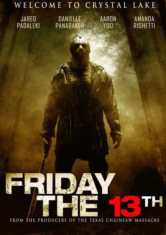
Friday The 13th - 2009
|
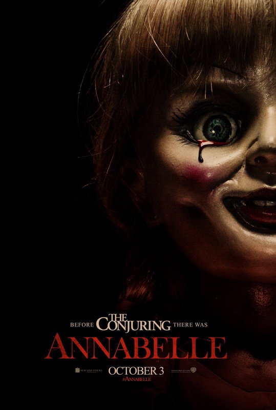
Annabelle - 2014
|
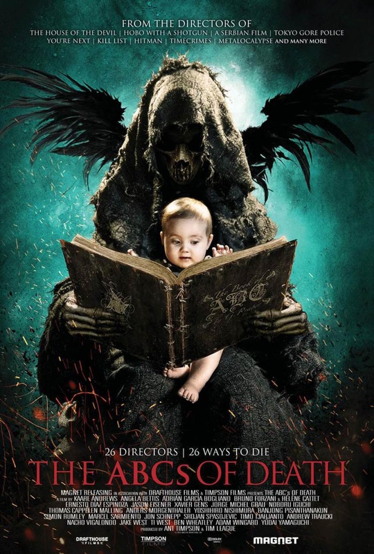
The ABCs of Death - 2012
|
Use of playing cards
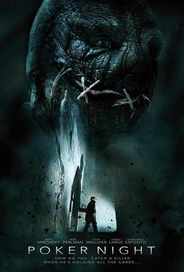
Poker Night - 2014
|
The only horror film we could find that includes any kind of gambling as a key theme was Poker Night - 2014, which also didn't include the use of any playing cards. We thought this would make our poster stand out as it is a concept rarely done and so would encourage members of our target audience to want to watch it or find out more.
|
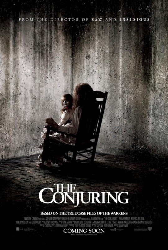
The Conjuring - 2013
|
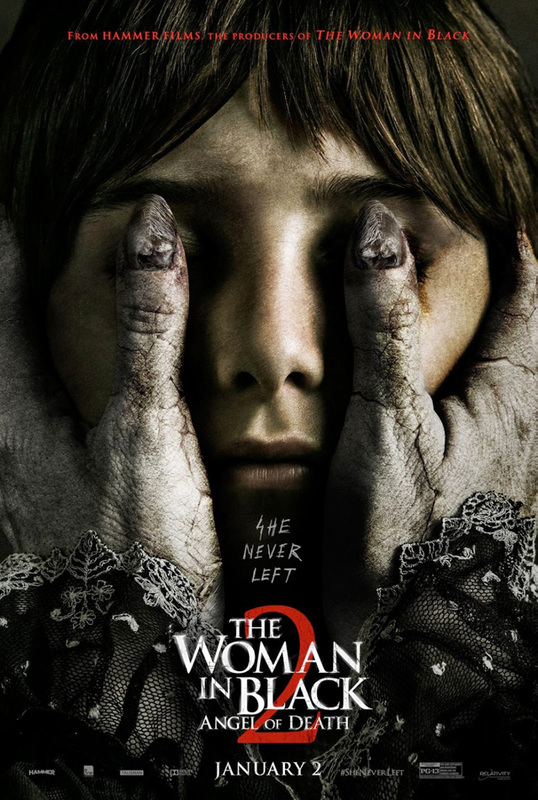
The Woman in Black 2: Angel of Death - 2014
|
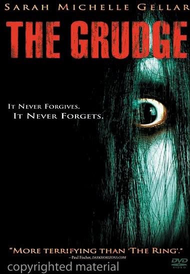
The Grudge - 2004
|
Using and developing forms and conventions in our magazine
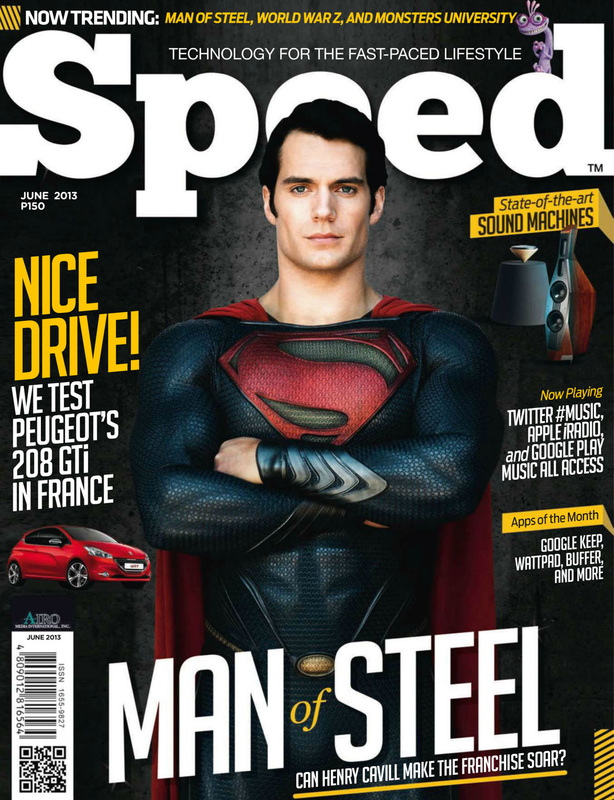
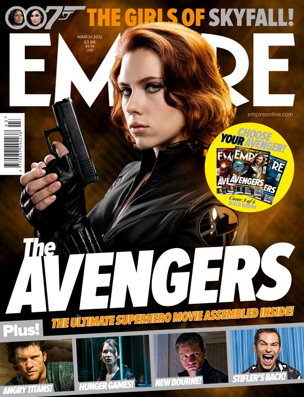
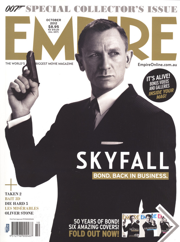
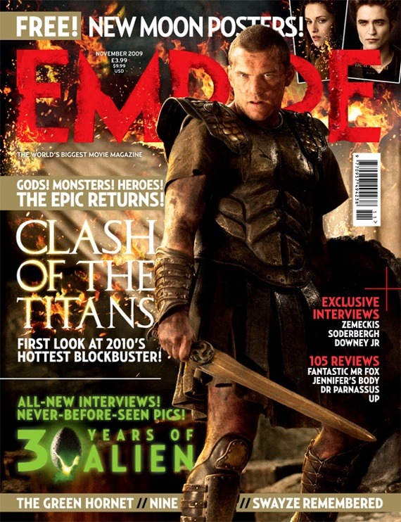
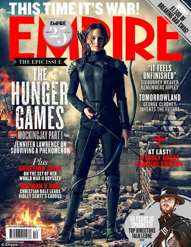
Main characters in front of magazine title
We have done this as we would rely more on the character to sell our magazine rather than the name of the magazine itself. The actor/ess is what is most likely going to persuade a member of the audience to pick up our magazine and buy it.
|
|
|
Having a 'banner'
These catch the audience's attention and also informs them of what else is in the magazine without them having to pick it up and look inside, meaning they are more likely going to make a brash judgement and decide if it is worth buying it to them.
|
|
|
Use of an iconic prop
Most characters have an iconic prop which adds to the movie's franchise. For our killer, it is simply a playing card as we wanted to carry the theme of gambling through out all of our media products.
|
|
|
